10 trends in packaging
designs in 2018
Nowadays, the consumer who chooses certain packaging has specified expectations towards it, which need to be met. Additionally, the packaging has also a function to fulfil. Fortunately, the packaging design evolve every year so as to let the appearing trends come up to the expectations of the most demanding customers and their changing needs.
The packaging fulfil many functions, and its main objective today is to attract the consumer’s attention. Therefore, brand managers pay great attention to distinguishing the packaging on a store shelf. The psychology of consumers’ behaviour proves that a client makes a decision whether to buy a given product within only a few seconds, thus it is so crucial to follow the latest trends and customers’ needs while designing packaging.
Here are 10 2018 trends in packaging designs:
1 Simplicity
2 Muted colours
3 Scrawling
4 Movie posters
5 Great words
6. Unique shape and material
7 Vintage style
8 Photography
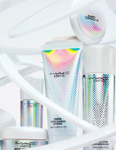
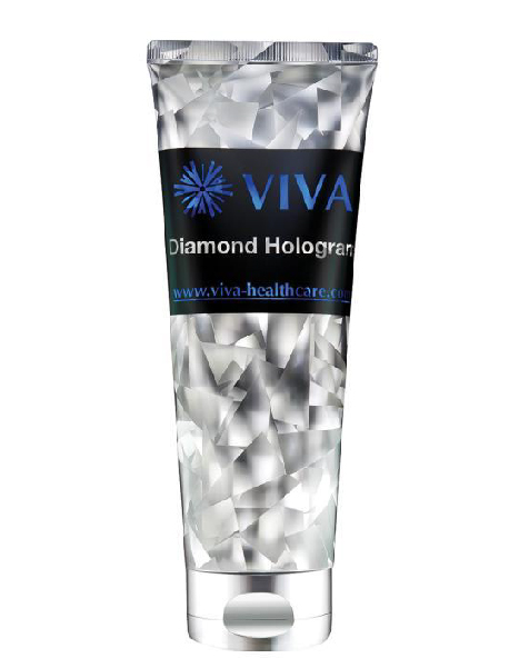
9 Holographic effects
10 Vibrating gradients
1 Simplicity
Minimalist design has existed for some time now and it will not change for a long time. Although it may seem to be a bit dull, abstractive and primitive, to keep things simple plays a key role and helps us to find what we are interested in. The most difficult part of reaching the minimum is to find symbols and signs which will appeal to most of the buyers. The symbolism of just a few words will make the consumer stop at the packaging for a longer time in order to concentrate and understand what your product is about.


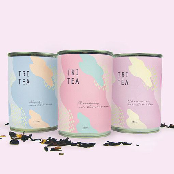
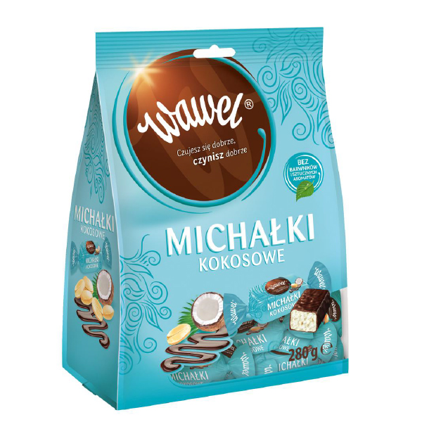
2 Muted colours
The 2018 will the year of the renaissance of feminine projects with soothing muted colours. Muted colours are our natural reaction to hyper-stimulating and exploding colours which can be more and more often found on store shelves. The reduced colour saturation makes the muted colours a great choice for creating soft, pale effect which results in a light and warm product, and this is translated into pleasant and friendly message for a prospective customer. Instead of being bombed with numerous colour stimuli, we prefer to look, touch, smell, taste and, eventually, buy a muted-coloured product peacefully.
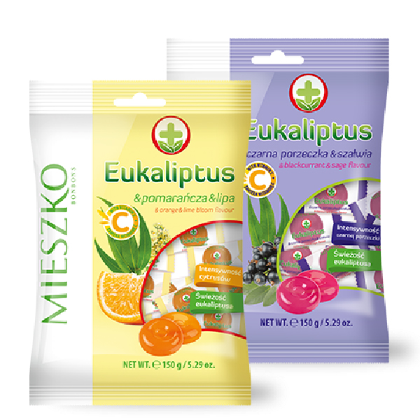
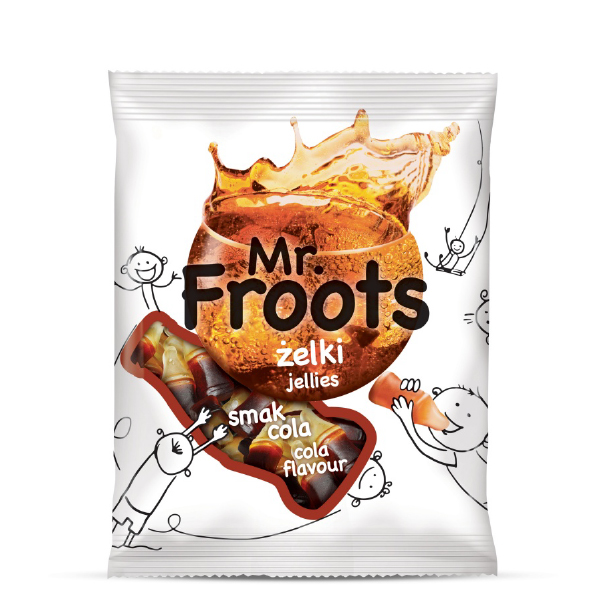
3. Drawingsi
We refer to scrawling in terms of 9-year-old kids and 90-year-old elderly, so we hit the target market. Adults think about them with affection, as it reminds us of children full of joy and energy we all used to be. And let’s be honest, nice scrawling can set us in a great mood every day. Drawings and inscriptions visible on packaging can change a product into a funny universe which was born in the imagination of someone who has decided to share their world with us. It is also a marvellous way to describe what is inside. Thanks to this we smile many times, even before we open the product. And whether we buy it or not – it is actually determined

4. Movie posters
Is there a better way to recall the same atmosphere and narration than to use movie posters which are sometimes respected to the same extent as the movie itself? Movie posters will always appeal to both unofficial fans and zealous collectors. It is not easy to get such a wide and effective market range. The poster-style design appeals to customers, taking advantage of narration which is closely related to the product, creating a unique identity.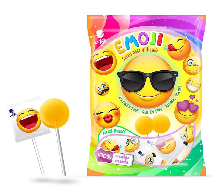


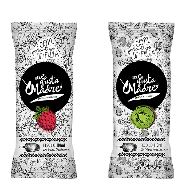
5. Great words
If you want to convince the consumer to your product in a simple, clear and unambiguous way, the great words may be the thing you are looking for. Words and slogans are a brilliant way to make your product noticeable. Whether it is a funny or a serious message, if it is a clear one, it will prove itself effective if you use an easy-to-read font. When combined with a smart selection of colours, your product will certainly pass the exam.
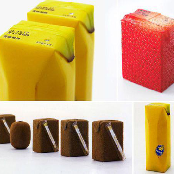
6.Unique shape and material
Those who do not pay attention to words or muted colours, but look for products of innovative shapes and materials belong to the group of consumers who are interested in “extreme packaging”. If you change the juice can into a piece of a bamboo tree or a tree trunk with raisin, there is nothing more to do than to place your logo on packaging. You need no more words. The technique allows in a spectacular and effective way to make the product attract attention.


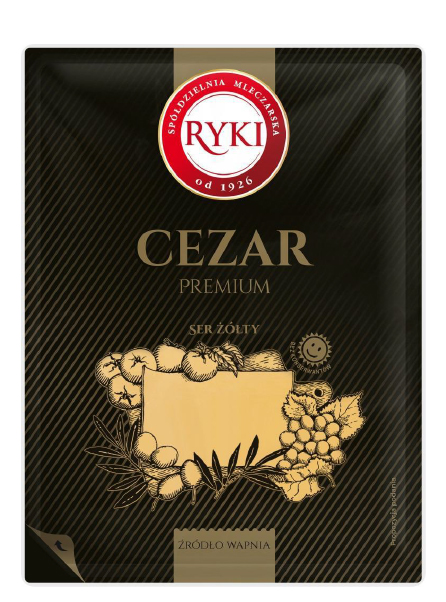
7. Vintage style
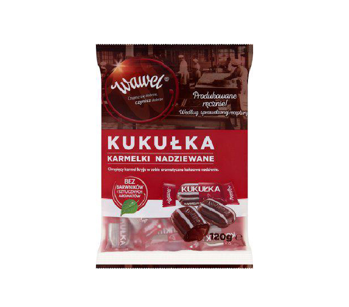
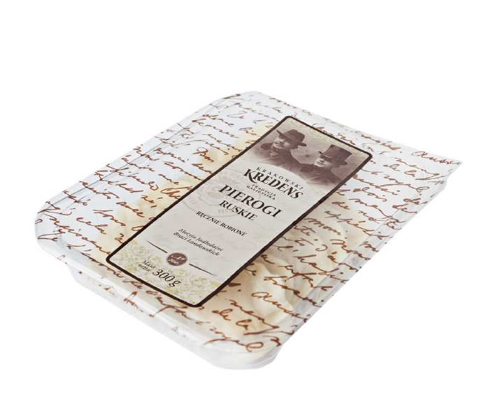
The trend of retro packaging has been noticeable for a couple of years. In the era of globalisation, many people search for regional, “homely” products, which recall family cuisine. They hark back to old recipes and natural ingredients, while telling the story of tradition, respect and passion. Obviously, the retro style has many faces. From Art Nouveau sumptuousness, to the avant-garde of the interwar period, to pin up stylistics and even the classic style of People's Poland. Each of the faces can be applied in different situations and channel the product to a different target group. A precise selection of the historic period to which we want to refer will be a key to the success of a whole vintage undertaking. The operation suggests to the potential customers that these are the products which may have existed even tens of years ago. But actually... What is the purpose? The answer is simple. It is widely thought that products manufactured in the past contain less preservatives and artificial ingredients than those produced nowadays. This allows to create trust among receipts, who begin to associate the product with something natural, deprived of an unhealthy chemical ingredients. It is worth mentioning here the example of Krakowski Kredens (which draws on both trends), Wawel or regional breweries.

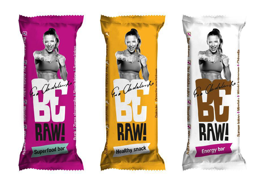
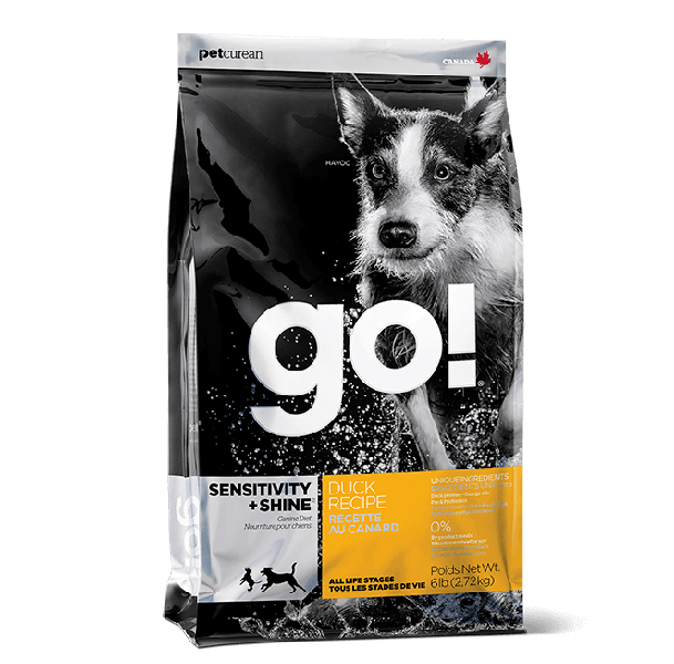
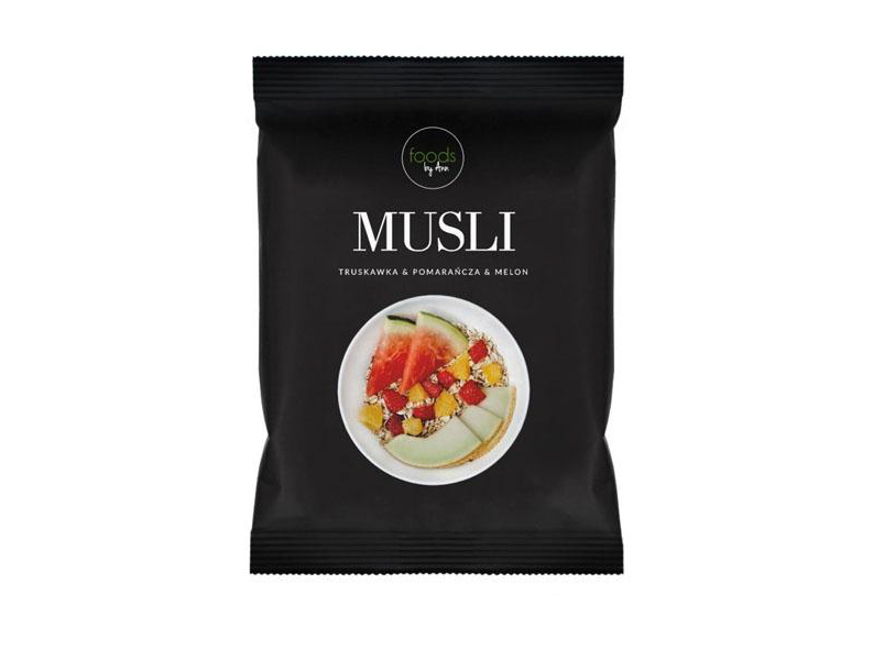
8. Photography
Photographs are successfully used on the majority of packaging. It particularly applies to the following situations:
a)when we need to present the product on a model, it is best to use a photo. Drawing tights does not result in any interesting effect, although you can find such packaging on the market.
b) when we hire a well-known person, it is better to use their photograph rather than try to reproduce them by means of illustration. Obviously, there exist exceptions to the rule.
c) when a model uses a product. For example, when a child plays with a toy which is inside the packaging.
d) photographs of dishes are also more “tasty” than their illustrations.
e) if a photograph is intended to show the effect of the application of a product. For example, a slim, fit model on the fit flakes packaging, or smooth thighs on the anti-cellulite cream packaging. Other emotions are shown on cigarette packaging with textual warnings and photographs of sick internal organs and tissues damaged by cancer. Such photographs present the negative consequences of smoking and may induce smokers to quit.
What do all these photographs have in common? It’s simple – they make the product look more authentic.